AEO MOBILE APP NAVIGATION
Designing a Mobile App Navigation
Skills Used: UX Design • User Research • Motion Design
About the Project
Project Goal
When the original AEO Mobile app launched it had a unique navigation structure that was not easily understandable by users and the app performance and ratings reflected that confusion. The goal of this project was to create a more usable app navigation pattern that allowed users to easily find a specific item or generally browse through the American Eagle product catalog, while also creating an engaging and delightful experience.
My Role
I lead the design iterations of the navigation and created low to high fidelity wireframes to communicate my concepts. I extensively researched platform standards to explore how we could use iOS and Android guidelines to create a more standard experience for our users. I prototyped the motion design of the experience to explore how each element in the navigation would transition from one page to the next.
I worked with a brand designer who advised on the final brand and font layer onto my high-fidelity wireframes and motion designs. I also met with product and business partners throughout the project to determine their needs and goals for the new navigation and get their feedback on the new designs.
Design Process and Approach
The navigation design underwent many changes throughout the design process. I began the project exploring navigation designs inspired by Google’s Material Design patterns, using images and large cards to enhance the navigation beyond just text. I also explored how to combine navigation and relevant product content on a single page so the user would only be one tap away from both navigation and products. Based on rounds of user testing, I decided to keep the screens focused on navigation in order to not overwhelm the user with content.
Final Navigation Experience
A Simple Navigation Pattern Lets the Content Shine
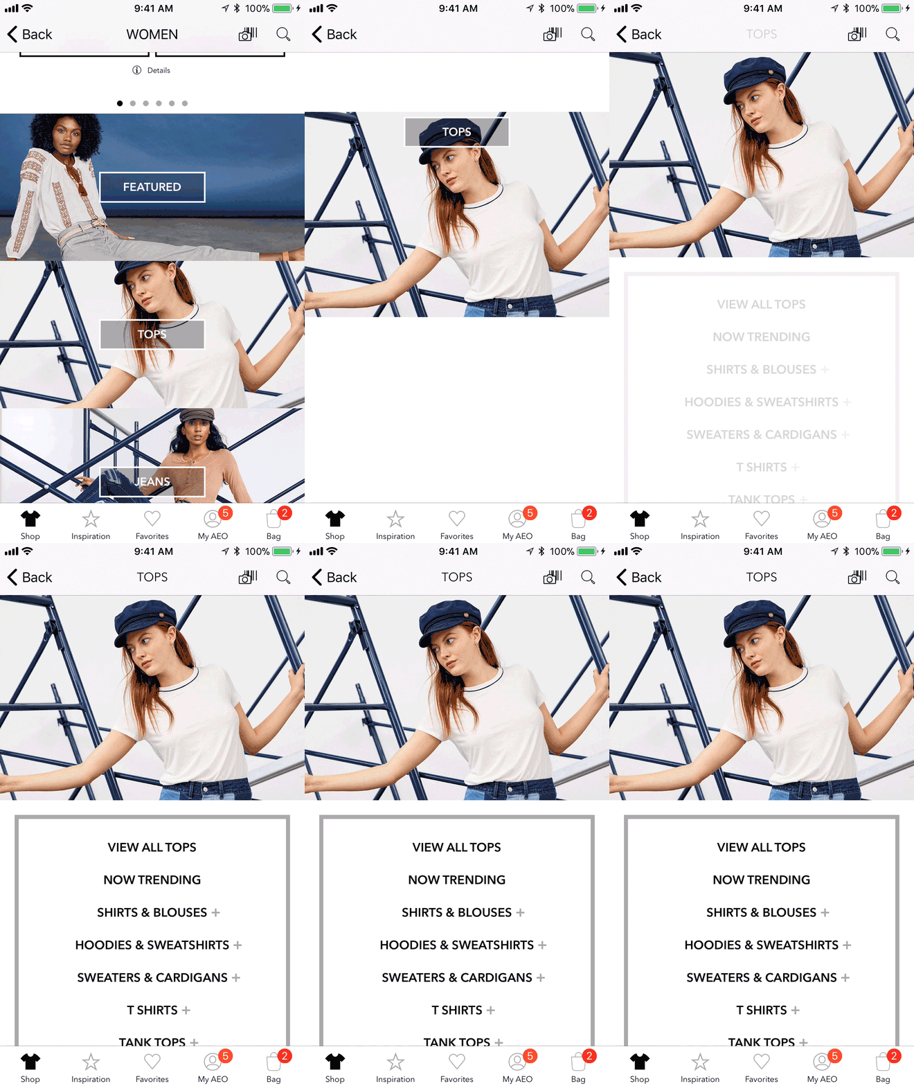
I chose to use a hub and spoke approach to keep the navigation simple and reduce the learning curve for the user. Just three simple taps gets the user from the homepage to the category page with products. Throughout my various design iterations, I always wanted to use imagery in the navigation to elevate the experience and create emotional brand moments as the user moved through the catalog. This differentiates the app navigation experience from web navigation patterns that often only use text. The use of imagery also shows the users examples of the products they will find within that category.
Animation Seamlessly Moves the User through the App
The transitions between the various navigation elements and pages was a key consideration of my design. Having a hub and spoke navigation model increased the number of taps and page loads the user would have to encounter compared to the previous navigation paradigm. I used motion as a way to make those transitions feel intentional and delightful. In post-launch user testing, no user commented on the number of taps to get to an item, instead saying that the app was "easy to use" and "modern".
Promotion Carousel puts Deals Front and Center
Our business partners wanted a simple way to communicate promotions to our app users. From user testing and feedback, we knew that our customers want to see current deals at a glance. To fulfill these two needs, we created a carousel at the top of the app homepage that lists all of the available promotions so users can scroll through the deals as soon as they open the app.
I also designed into the brand cards the ability to tap to apply a promo code directly to a user's order. This is an app-only feature that helps to streamline the checkout process for our loyal app users.
Results
Through this redesign, I created a simple navigation pattern that uses motion and images to guide the user through the navigation step by step. This navigation redesign helped the app reach a 100% year over year increase in revenue the first year after launch and it continues to help the app maintain a 4.5 star rating in the iOS app store and a 4.2 star rating in the Google Play store. I ran post-launch usability testing which also yielded very positive results, with users saying that the design was "modern", "simple" and "easy to use".


